The Project
Muse is an art exhibition app that allows users to visit a museum style exhibition virtually. Muse strives to replicate and elevate the museum experience in an engaging and thoughtful way. The app’s features are presented in the same layout as a typical museum and integrated museum maps can even guide users through museums in person.
Replicate the in-person museum exhibition experience in a thoughtful manner
Design an accessible and intuitive app
Include detailed information, smart museum maps, and a personal archive
Build. Measure. Learn.
I used Lean UX principles in the development of "Ukor" to focus on users and their needs at each phase of the design process.
Walk client through our Client Benchmark to understand client's ambition and brand vision, mission, voice
Research and validate the client/brand hypothesis.
Conduct early user testing with rough sketches to unveil unexpected pain points.
Externalize the work using sticky notes, printouts, or sketches.
Brand Canvas
There are three brand canvases to go through each with their own categories to fill out. The first is the company vision. This is where everyone describes what they think the goals, purpose, vision, strengths, and weaknesses are of the company.
The second is the client vision. Here everyone describes their ideal product persona and the goals the product will help them achieve. They will also describe in detail the journey a user will go through with the product, starting from where they learn about the product.
The third canvas is the market vision. Here is where the clients define who their competitors are and what companies inspire them and their product.
Preliminary User Research
Kickoff
In Muse's design process, we opted for a goal-directed design approach that helped us move along through the timeline smoothly. Qualitative research methods proved to be the most effective during our design process, most notably our user interviews and usability testing sessions. Whenever we encounter an issue that we are trying to solve, it's smart to build a good foundation. In Muse's case, we did this by asking some generic but useful internal questions.
"Is there domain specific knowledge to know?"
"Who are our biggest competitors?"
"What are the challenges we will face moving forward?"
"What do our users need the most in a product like this?"
"Who is our primary audience?"
"Which users are most important?"
Preliminary Ideation
Based on the user research I set up three personas and referred to them throughout the entire product development process.
Each persona identified a realistic goal the user might have when working through this app.
The information about each persona focused on its goals and frustrations with the product as well as their interaction with it, which drastically affected my design decisions.
Unmoderated User Survey
I created a 20 question Google forms survey that included short answer and multiple choice questions to keep the interviewees engaged. I posted the survey to Linkedin and Facebook with a short introduction to explain for what the survey information will be used. I got 16 responses. Most interviewees said they often go to museums for fun and would value being able to access a virtual museum exhibition experience.
58% said they visit museums less than once a month in person, but 81% were interested in being able access museum exhibitions virtually.
75% said the limited time exhibitions make them more likely to visit a museum. Solution: include featured/limited time exhibitions to replicate this interest.
25% mentioned that they want the app to include a smart museum map feature to use while in the museum physically to aid in wayfinding and elevate the in person experience.
Meet the Users
Muse is an art exhibition app that allows users to visit a museum style exhibition virtually. Muse strives to replicate and elevate the museum experience in an engaging and thoughtful way. The app’s features are presented in the same layout as a typical museum and integrated museum maps can even guide users through museums in person.
User Stories and MVP
User research and persona creation brought up the user's main needs, goals, and behaviors. Therefor, I found the main issues my design decisions needed to solve were:
Uncertainty about achieving goals
Instant help from health professionals
Ability to review each module and analyze goals
Set time for each module to keep up motivation
Based on this information, I was able to create user stories and define the MVP.
Creating a Framework
To better understand how we would construct the core experience for Muse, we designed a user flow. This helped us focus more on the experience and needs of the user and less so on the details that we would solidify later on. It also allowed us to communicate the entries and exits more clearly so we would have a better understanding moving forward.
Preliminary Wireframes
Taking the time to draft iterations of each screen on paper ensures that the elements that make it to digital wireframes would be well-suited to address user pain-points. I prioritized intuitive navigation and thoughtful exhibition layout to help imitate a real museum experience.
Users found the label "Module" misleading, it didn't indicate the continuation of an ongoing chapter clearly enough.
Users value the option of being able to reread finished lesson articles.
Users asked for the option to see "ongoing" and "finished" lessons.
Include an “archive” where users can accessed saved art or exhibitions to find easily to view later
Intuitive navigation was a key feature to address in the designs in order to provide a painless experience
A blog page was added to revisit completed lesson articles.
Prototyping
I turned my revised sketches into interactive prototypes in Figma. I defined UI elements, design patterns and visual hierarchy. I tested the prototype in person and remotely.
Users wanted the ability to search and filter through blog articles.
Users wanted the option to read upcoming lesson articles before completing the ongoing section.
Users valued the feedback screens after completing each lesson.
A search bar and filter were added to the blog page.
Completed and future lesson articles were made available in the blog page.
Featured Exhibitions
On Homepage
Search Page with
Quick Guides
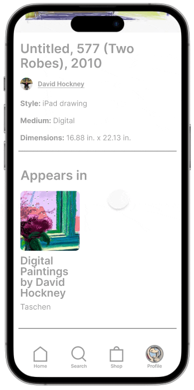
Exhibition Experience
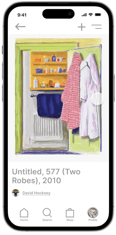
Add Art to Collection
in Archive
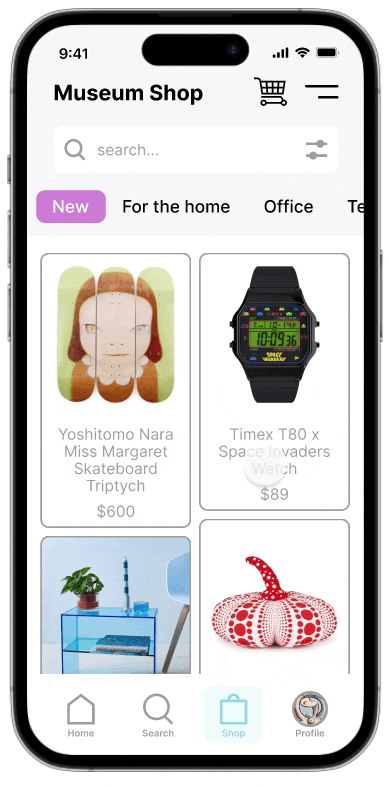
Museum Shop
Save Exhibition and
Artist to Archive
What have I learned from this project?
Figma is an insanely powerful tool. Users, stakeholders, and designers can collaborate and benefit from this software.
Personas are powerful: Being aware of user's needs and pain points helped me to create a seamless, intuitive, end-to-end experience.
The user is always right: Conducting user testing and evaluating user's feedback at various stages of the UX process helped me to discover and eliminate paint points at early stages.


